Intelligence in Graphic Design
In the article below I am sharing brief and compressed theses and insights about intelligence in design. I have combined knowledge from the books published by practicing designers with my personal experience. Enjoy the reading!
When does design become intelligent?
Intelligence, when it comes to the field of design, means a neat approach to the subject. In short, intelligence is the opposite of innocence — a deeper, more complex understanding of the world and its contradictions. The designer’s goal is to quickly deliver the message “This is rational and intellectual”.
When the design has a smart solution behind it, it makes the observer feel more intelligent, capture the main message through solving a visual puzzle, and, therefore, perceive tighter connection to the product.

Certain collaterals require the appearance of intelligence, for example, a medical brochure, or a science poster, or even a promotional advertisement for a hobby horse festival. However, intelligence in design does not exclude affirmative behavioral requirements: usability, clear function, and a recognizable form. A neatly designed item that is impossible to understand may be intellectually challenging, which is not inaptitude or overdoing itself, but it may fail to keep the user engaged.
How do we distinguish intelligent design from unpurposeful, chaotic one?
It may sound like hubris if we say that only observation followed by detailed analysis can train you to immediately understand what is before you, whether a decent piece of art or a common thing. I suggest taking a glimpse at the following example and answering a few questions:
- What message is this design delivering?
- Does the design have any main ideas?
- If there is anything unusual in the typography and imaging choices? If so, why?
For example, the brand identity made by Pentagram Studio for Saks Fifth Avenue shop bases on exquisite black and white color combination, following the principle 'less is more'. Flexible and adjustable tile-like solution lets to play with elements and makes all identity more dynamic.

A designer could pick certain typography with a reference to the era. For instance, the american travel posters often refer to art-deco zeitgeist (zeitgeist (ger.) — the spirit of time), with its futuristic, curvy, and tall letterforms and contrast color palette.

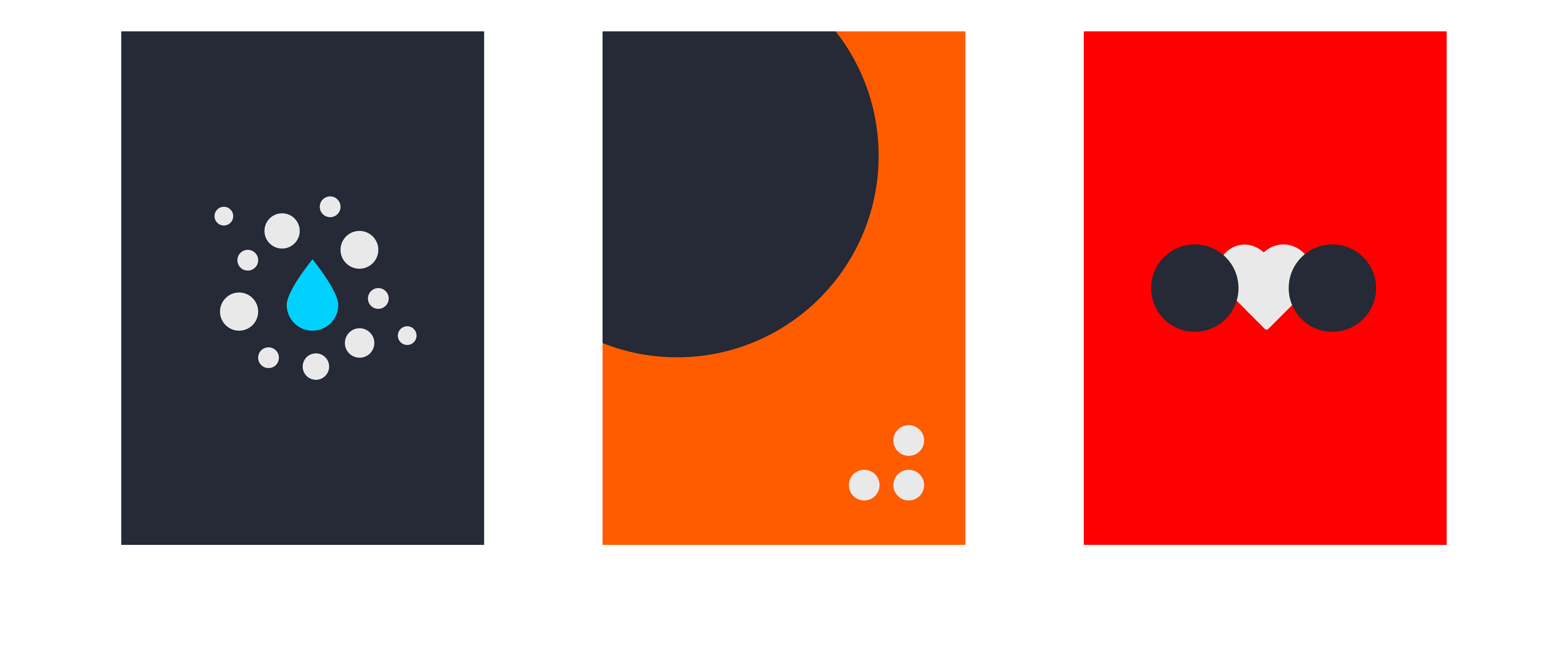
You don’t always need a large number of assets or complicated solutions to deliver a sophisticated message. Here is the project for the art exhibition. It consists of seven posters and each of them represents one of the seven deadly sins. The main goal of the project was to imprint a recognizable image of a sin definition using only simple shapes and a limited color palette (3 colors per image). Could you name the sins according to the posters? Try to do it. I hope you’ll capture all of them. The answers are below at the end of the post.

As human beings, we are social and self-aware. We can recognize and decipher the information that relates to our cultural experience, and conceptualize experiences beyond our own. And with experience over a lifetime, we become able to perceive and operate with more visual information. Various fields require multiple design solutions. For example, navigation in the supermarket has to be as simple and understandable as possible, because it covers a vast audience of different ages and abilities. Overdesign at this point may be pernicious, and may lead to misunderstanding, illegibility, and a mess eventually. But a fashion house can choose a completely different approach, wrapping the simple message into an intricate and puzzle-like design.
The article was inspired by Sean Adams' book 'How Design Makes Us Think and Feel and Do Things'.
Answers for Seven Sins posters:
First row: Envy, Gluttony, Greed, Pride.
Second row: Sloth, Wrath, Lust.
